Printing on the web
A quick overview of some of the biggest sites on the web and how they fail at Print CSS
Recently I have been spending a lot of time thinking about printing on the web and how much time web developers should spend on print stylesheets.
I don’t think that there is a correct answer, it depends on two things:
- Is the content likely to be something that needs to be printed out?
- Is the audience likely to desire to print the content out?
For example, a blog with long form articles immediately sounds like something that would benefit from potentially being printed nicely, but what if the articles were exclusively for mobile device users? Are they more likely to view your content on a screen or at least save it off to an offline service?
What interests me are sites that don’t have an immediate need for print style sheets but might be large enough that someone at some point in time would like to print them off.
Anyway, this article doesn’t attempt to dig into those questions, what I want to show off in this article is how some websites look when printed, and maybe open up a discussion on if they have hit the nail on the head or if they need to rethink their stylesheet.
I have chosen websites that wouldn’t have a massive use case for printing and also a few that would have a use case for printing.
All the images show off the first page of the print out and can be accessed in full by clicking on them.
I was trying to think if I would ever want to print off anything from my Facebook wall, I don’t think I would - but as it is one of the most popular sites on the web I figured it would be worth including.
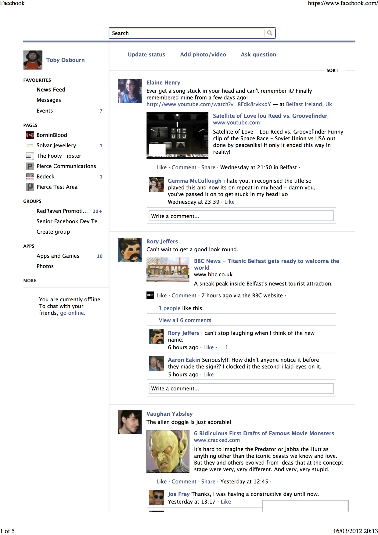
This was taken straight from my wall and as you can see it is a bit of a mess, elements that serve no purpose on a printed sheet are included (the search box, navigational elements) and things that could do with being expanded are not.
As I said I don’t know when I could see myself printing anything off from Facebook, but to be honest if there was a thread that I wanted to print I feel a little let down that there hasn’t been some thought put into it.
Google Plus
If I am going to mention Facebook I should also mention the other big social networks, the next of which is Google Plus. Unlike Facebook I can actually see myself printing articles off of this site, most of the people I follow are interesting and often write longer posts worthy of an offline read.
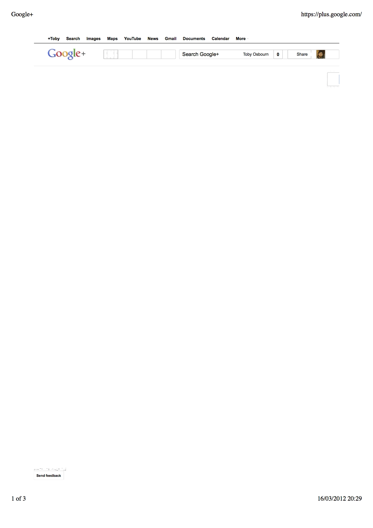
This is the first page from the main timeline, I don’t have much to comment here other than Google have dropped the ball - I think it is one thing to not have a specific stylesheet for print to improve it, but when it is actively broken, bad form!
By this stage I am not holding out much hope for social networks, I am kind of assuming that the developers just don’t feel there is a valid use case in printing their pages and think the couple of hours of effort and extra space overhead aren’t worth it.
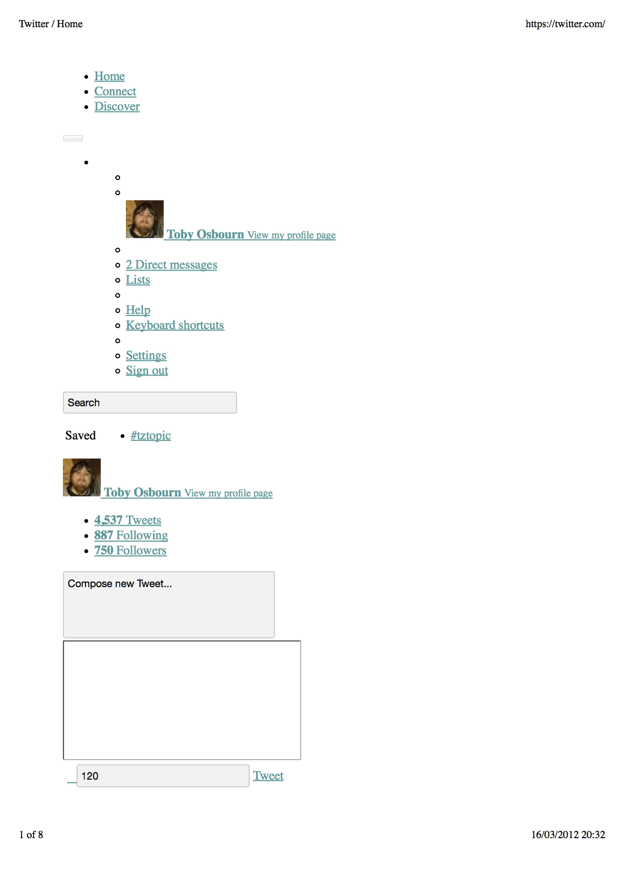
Much like Google Plus I have to say the ball has been well and truly dropped, there is nothing of use on the first page of the print out at all.
Next up we have Google Search, this is something I have actually had call to print out before and my memory was that it worked OK, today when I tested this was the result.
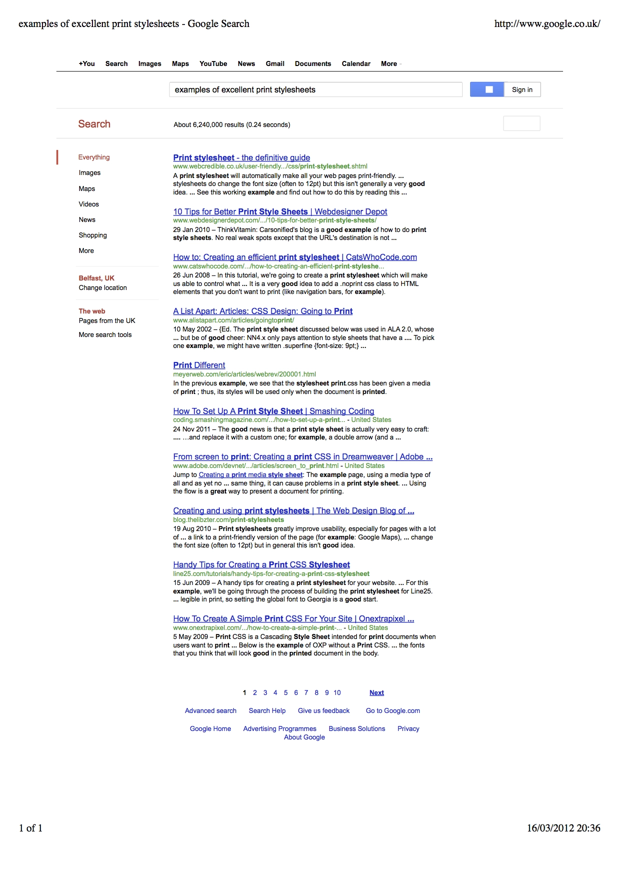
Much better, kind of like the Facebook print there are elements that could be removed (navigational) but this is the first printout that fits nicely onto one page.
Expanding the URLs would be good.
Wikipedia
Now this is a site I would expect to get printed quite regularly and the first site that I would be pretty annoyed about if they got it wrong.
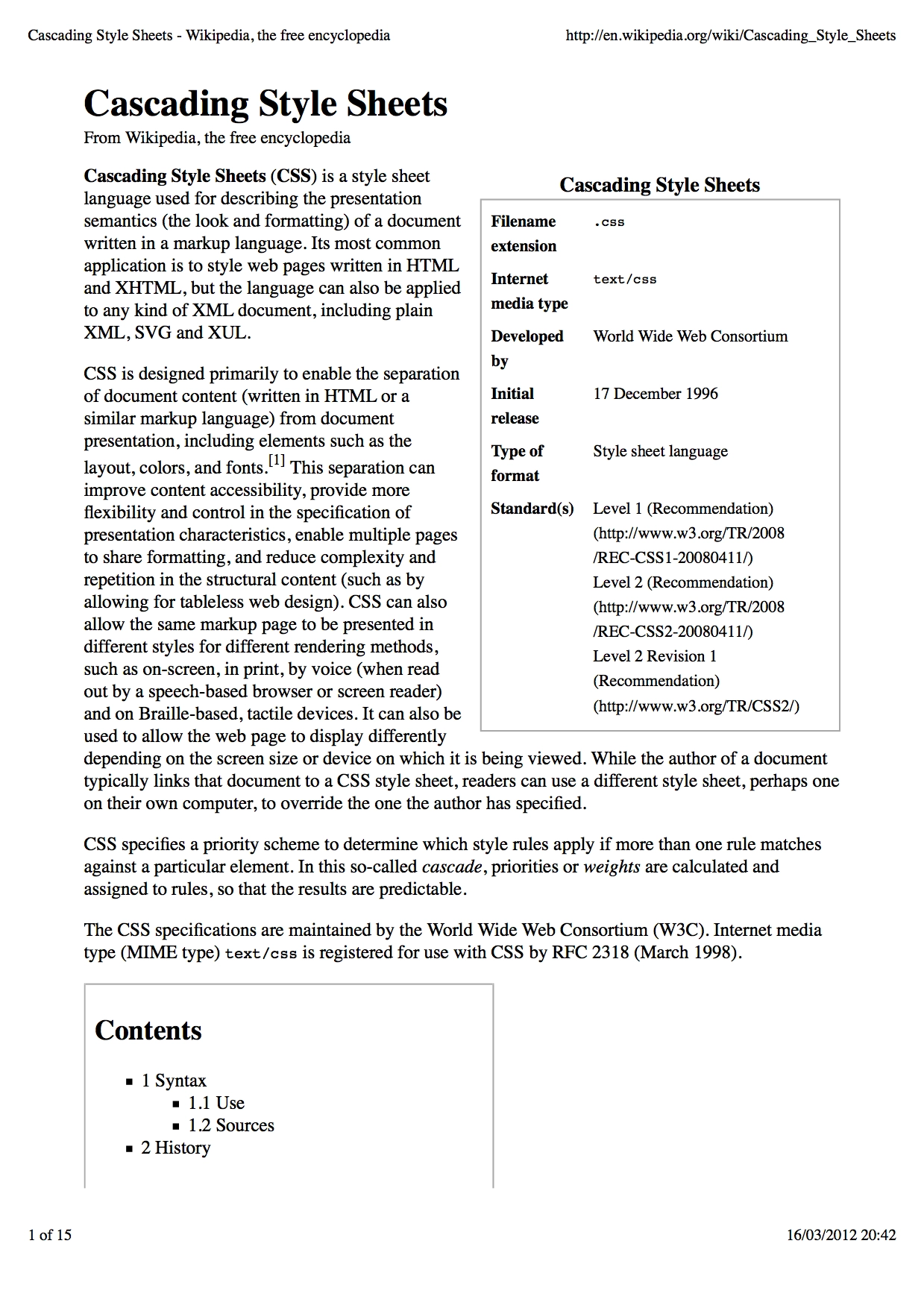
It is pretty good - It is the first where font has been made larger and there has been a clear removal of unnecessary elements.
There could be better styling in the contents section and it doesn’t handle breaking over the page well, but it is certainly readable and useful.
Hacker News
I figured for my next test I would try and print out a comment thread from Hacker News. I have wanted to do this once before as there is a lot of worth to be found within them.
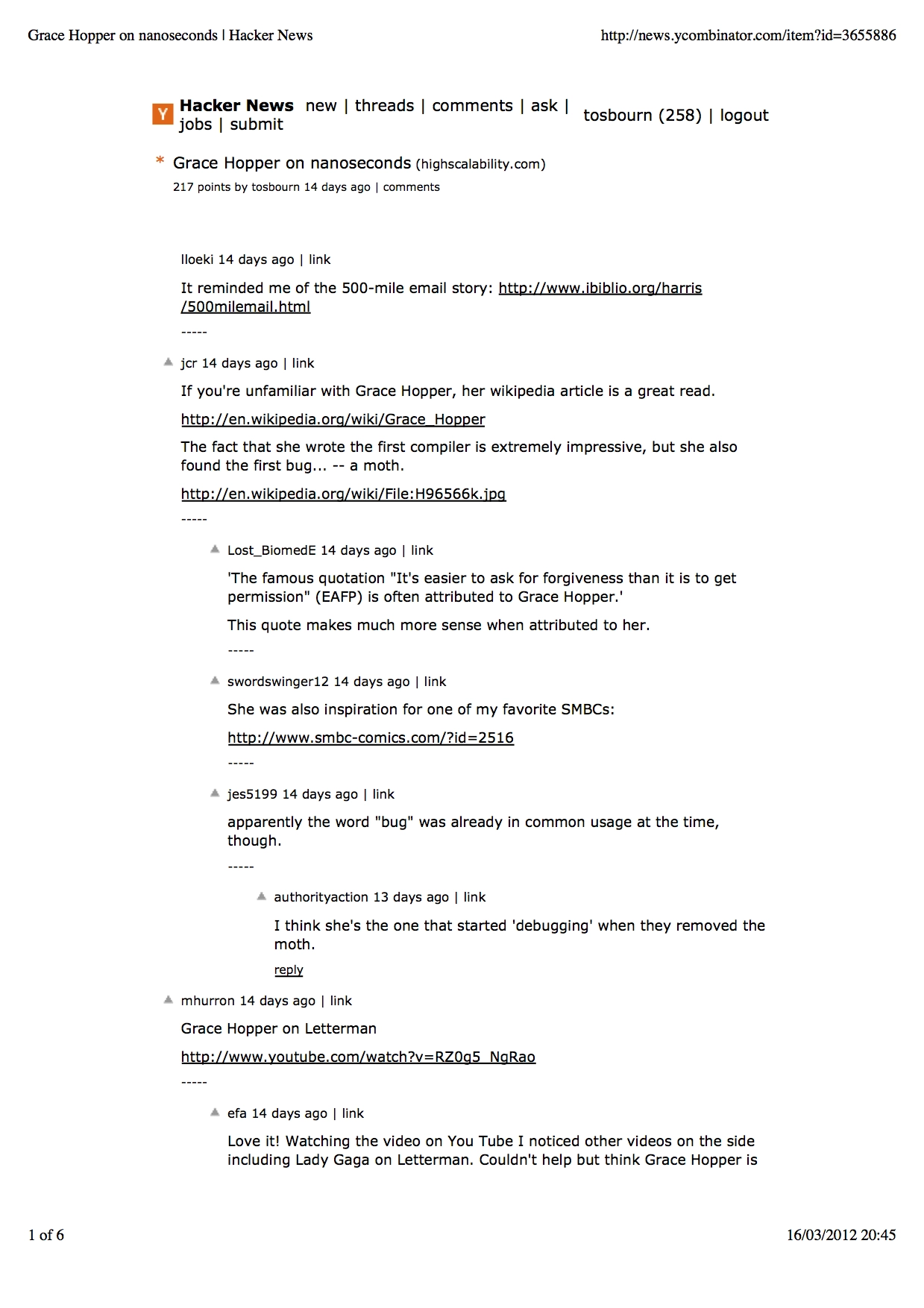
As you can see it doesn’t look like they have made any special effort to cater for people printing their articles.
It wouldn’t be fair to show Hacker News without showing a similar site, so I chose Reddit and again I chose the comments thread as again this is where you can find a wealth of information.
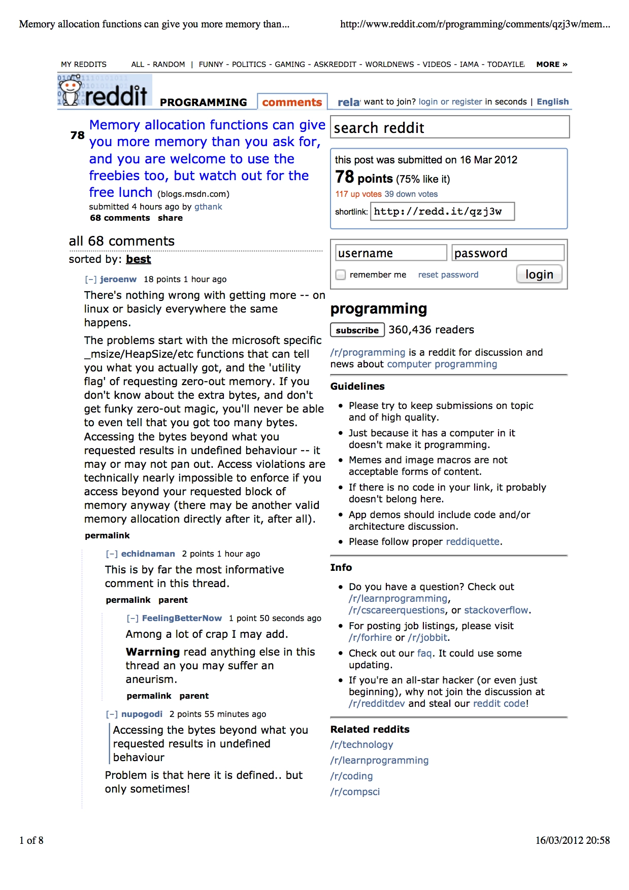
More of the same really, no thought put into the print stylesheet at all, by this stage I am too depressed to comment much further.
Smashing Magazine
Right, I wanted to end on a high by picking a well known website that a) has reason to need to be printed and b) has definitely talked about printing in the past - if this site doesn’t deliver I will eat my hat.
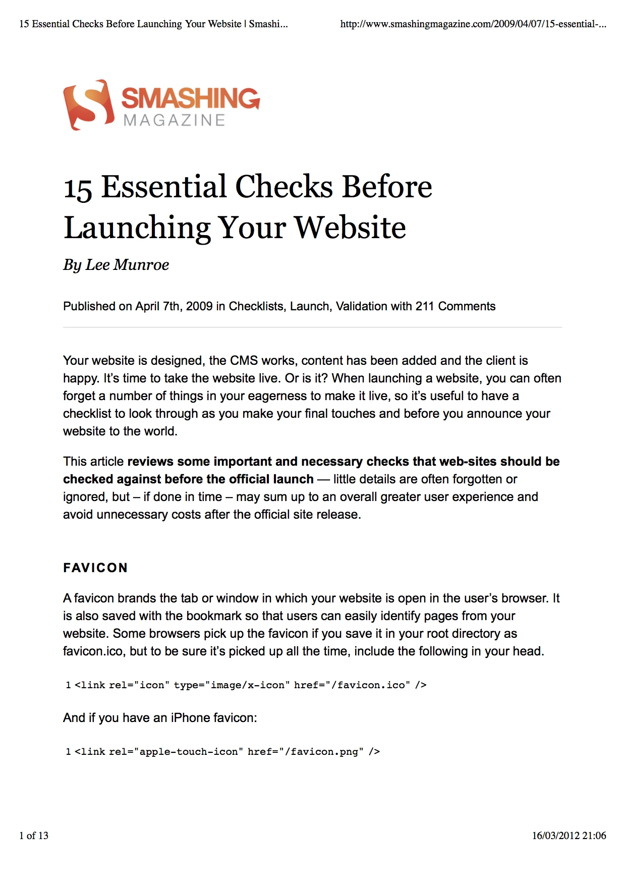
Phew.
Conclusion
It is my opinion that most of these sites have dropped the ball by not providing a good print fallback for their content.
I am aware that print as a medium is dying, but that isn’t to say that there is never a use case for it anymore, as an industry I think we can do better.
