Bad example of how to do unsubscribe pages
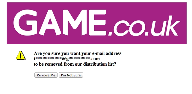
Here's an example of how Game have a terrible unsubscribe page
Today I received an email from Game. If you don’t know who Game are they are a video game shop in the UK, not really that important for the blog post but I like my readers to be informed.
I have little interest in what Game have to say anymore so I figured I would unsubscribe from their list, which has actually made me think I should write up a blog post someday on reasons why you should unsubscribe rather than just deleting or putting in filters.
As normal I scrolled to the bottom of the email and scanned for the unsubscribe link, all credit to them I found this with no bother at all. This next screen kind of took away from the experience though;

How the heck do I know if I am sure I want to remove t***********@g*********.com?
This stinks of some sort of speculative security measure without any actual use cases being thought out, a horrible user experience and one that left me clicking ‘Remove Me’ because if t***********@g*********.com didn’t pertain to my email address then I was doing someone else a favour by removing them.
If there is some way for someone to get to that page without clicking on a link that was originally sent to the correct persons email address then Game need to fix that, not obscure the email address in case some non-genuine person is looking at it.
Whilst I am ragging on this page, it also feels a little weird that they didn’t try and subtly sell me something, even a small banner below the form that had the latest releases or something. I don’t want there to be one big advert or for it to take away from my core goal (confirming my subscription status) but having every page as a sales tool seems like e-commerce 101?
